Custom UI
In the library /res/layout folder, you can find the view layout that the library use to build up the payment form.
Feel free to customize the layout to suit your application.
However, you are not suppose to change the viewID.
Layout Customization
The proper way to customize the layout is to copy the specific layout from the library /res/layout folder into your application /res/layout.
From your application /res/layout, you can change the content to suit your application.
There are four main files to build up the form payment:
1) Credit Card :
layout_my2c2p_payment_cc_card_details.xmllayout_my2c2p_payment_cc_store_card.xml
2) Installment :
layout_my2c2p_payment_installment_card_details.xmllayout_my2c2p_payment_installment_store_card.xml
NOTES:
- You can change the layout to your heart content, however you
CANNOTchange the view id. - All view are
mandatoryexcept foret_emailandet_storedCardEmail, if you don't want to display the email field, you can hide it withandroid:visibility="gone".
Secure Pay
SecureEditTextareREQUIREDby SDKversion 2.8.8and above.- Class path for
SecureEditText:com.ccpp.my2c2psdk.secure.ui.SecureEditText.
    <com.ccpp.my2c2psdk.secure.ui.SecureEditText
        android:id="@+id/et_cardNo"
        style="@style/My2c2pSDK.Widget.EditText"
        android:hint="@string/my2c2pSDK_hint_cc"
        android:inputType="number"
        android:maxLength="16" />
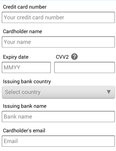
Credit Card View Summary : layout_my2c2p_payment_cc_card_details.xml
| No. | View ID | View Type | Mandatory | Description |
|---|---|---|---|---|
| 1 | et_cardNo | SecureEditText | Y | Credit Card no |
| 2 | et_cardHolderName | EditText | Y | Credit Card holdername |
| 3 | et_expiryDate | SecureEditText | Y | Credit Card expiry date |
| 4 | et_cvv2 | SecureEditText | Y | Credit Card security no |
| 5 | et_bankCountry | EditText | Y | Credit Card Issuer Bank country |
| 6 | et_bankName | EditText | Y | Credit Card Issuer Bank name |
| 7 | et_email | EditText | N | Cardholder Email |
| 8 | cb_storeCard | String | Y | Checkbox to allow storecard |

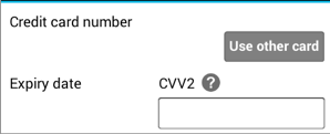
Credit Card View Summary : layout_my2c2p_payment_cc_store_card.xml
| No. | View ID | View Type | Mandatory | Description |
|---|---|---|---|---|
| 1 | tv_maskedCardNo | TextView | Y | Masked Credit Card No |
| 2 | btn_changeCard | EditText | Y | Button to change card |
| 3 | et_storedCardExpiryDate | SecureEditText | Y | Credit Card expiry date |
| 4 | et_cvv | SecureEditText | Y | Credit Card security no |
| 5 | et_storedCardEmail | EditText | N | Cardholder Email |

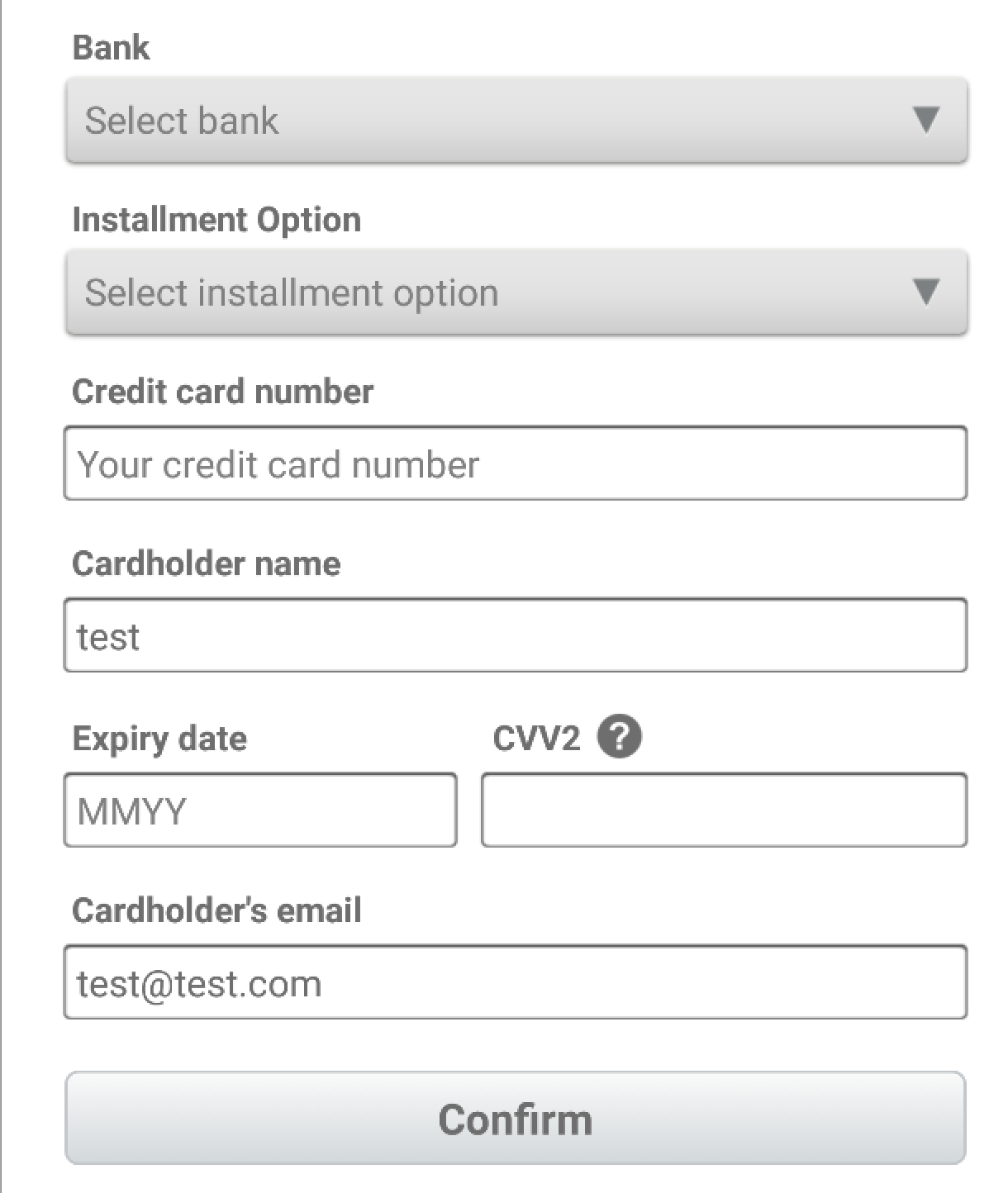
Installment View Summary : layout_my2c2p_payment_installment_card_details.xml
| No. | View ID | View Type | Mandatory | Description |
|---|---|---|---|---|
| 1 | et_cardNo | SecureEditText | Y | Credit Card no |
| 2 | et_cardHolderName | EditText | Y | Credit Card holdername |
| 3 | et_expiryDate | SecureEditText | Y | Credit Card expiry date |
| 4 | et_cvv2 | SecureEditText | Y | Credit Card security no |
| 5 | et_email | EditText | N | Cardholder Email |
| 6 | cb_storeCard | String | Y | Checkbox to allow storecard |
| 7 | et_bank | EditText | Y | Installment Bank |
| 8 | et_installmentOption | EditText | Y | Installment Option |

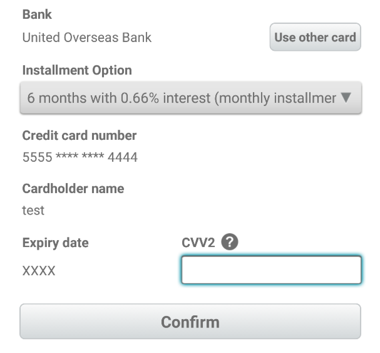
Installment View Summary : layout_my2c2p_payment_installment_store_card.xml
| No. | View ID | View Type | Mandatory | Description |
|---|---|---|---|---|
| 1 | tv_maskedCardNo | TextView | Y | Masked Credit Card No |
| 2 | tv_maskedCardHolderName | TextView | Y | Credit Card holdername |
| 3 | btn_changeCard | EditText | Y | Button to change card |
| 4 | et_storedCardExpiryDate | SecureEditText | Y | Credit Card expiry date |
| 5 | et_cvv | SecureEditText | Y | Credit Card security no |
| 6 | tv_maskedBankName | TextView | Y | Installment Bank |
| 7 | et_maskedInstallmentOption | EditText | Y | Installment Option |
| 8 | et_storedCardEmail | EditText | N | Cardholder Email |

Style Customisation
If you want to customise the theme, you can just copy the library style to your res/values/theme.xml or res/values/styles.xml.
e.g. If you want to change my2c2p button style, you can copy the style from the library res/values/styles.xml to your application style.xml and change it from there.
    <style name="My2c2pSDK.Widget.Button" parent="android:Widget.Button">
        <item name="android:textStyle">bold</item>
        <item name="android:textColor">@color/my2c2psdk_dark_grey</item>
        <item name="android:layout_width">fill_parent</item>
        <item name="android:layout_height">38dip</item>
        <item name="android:background">@drawable/my3dsdk_nav_btn</item>
    </style>
Color Customisation
If you want to customise the color, you can just copy the library color to your res/values/color.xml.
e.g. If you want to change my2c2p red color, you can copy the style from the library res/values/color.xml to your application res/values/color.xml and change it from there.
<color name="my2c2psdk_red">#CF0D14</color>
Drawable xml Customisation
If you want to customise the drawable xml, you can just copy the specific drawable xml to your res/drawable/ folder.
e.g. If you want to change my2c2p button red style, you can copy the style from the library res/drawable/btn_red.xml to your application res/drawable/btn_red.xml and change it from there.
    <selector xmlns:android="http://schemas.android.com/apk/res/android">
    <item android:state_pressed="true" >
        <shape>
            <solid android:color="@color/my2c2psdk_red_pressed" />
            <stroke
                android:width="1dp"
                android:color="@color/my2c2psdk_red_pressed" />
            <corners
                android:radius="5dp" />
        </shape>
    </item>

    <item android:state_focused="true" >
        <shape>
            <solid android:color="@color/my2c2psdk_red_pressed" />
            <stroke
                android:width="1dp"
                android:color="@color/my2c2psdk_red_pressed" />
            <corners
                android:radius="5dp" />
        </shape>
    </item>
    <item>
        <shape>
            <gradient
                android:startColor="@color/my2c2psdk_red"
                android:endColor="@color/my2c2psdk_red_tinted"
                android:angle="270" />
            <stroke
                android:width="1dp"
                android:color="@color/my2c2psdk_red_pressed" />
            <corners
                android:radius="5dp" />
        </shape>
    </item>
    </selector>
